HiDive’s website redesign is an accessibility nightmare
About a 4 minute read
Written by Kyle Hawk on Apr 26, 2024
Updated on Jan 12, 2025
#accessibility #anime #hidive
It’s that time again for me to add seasonal anime to my random anime site. Before I start, I always run my local scripts that grab streaming information for the sites I link to on the website (Netflix, Hulu, Crunchyroll, HiDive). Well.. my HiDive script was broken. Turns out, they redesigned their site and it looks nice.
It may look pretty, but holy shit the semantics are bad. Not only that, if I were using a screen reader, I would definitely be lost.
Now I know what you are thinking.. “If I’m blind, why would I be watching anime”. Maybe a blind person likes listening to the voices like an audiobook? Maybe they aren’t blind, but suffer from one of the many illnesses that can impair sight. There are tons of reasons why someone would choose to use a screen reader.
Now. What did I find?
Divs, divs everywhere!
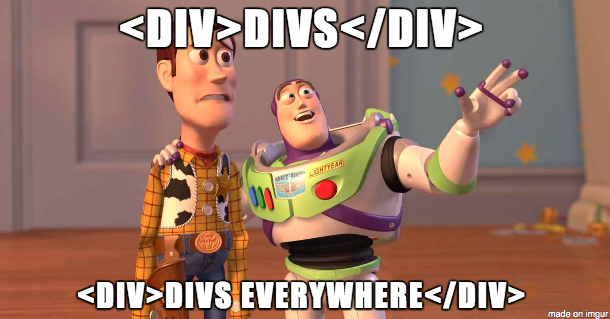
Everything is in a div! It’s like div-ception. Div, div, div, div, div. There are some span, buttons, and p tags sprinkled in but, for the most part, everything is a div. That’s not to say divs are bad, but you have to be aware there are tons of semantically correct elements to be used. Don’t worry, they made the top-most parent element, right under the body, a section. Pack it up boys, job’s done.
Do you want to know what I noticed was missing first? HEADINGS! h1, h2, h3, none of them are present. Their logo, the headings to each carousel, even the anime “titles”. None of them are headings, but instead spans and divs.
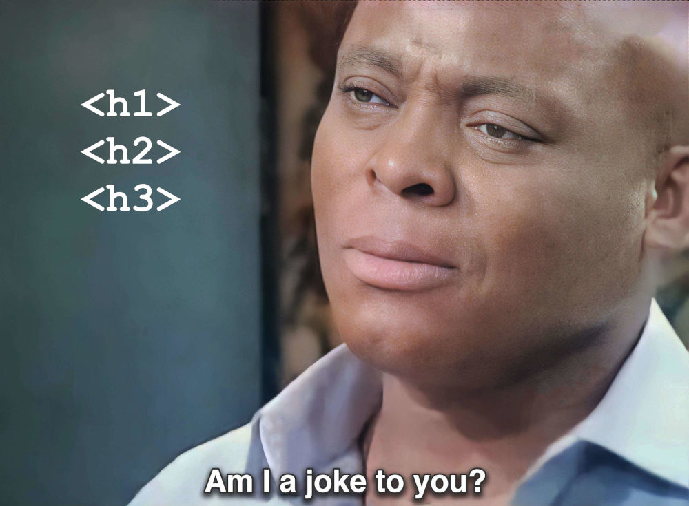
Does this affect the typical user on the site? Not really. I mean they are styled to look like headings, they’re just IMPOSTERS! Where this comes in to play is, again, with screen readers as well as page crawling. Though, I don’t think they’re worried about page crawling since it’s behind a log in anyway.
Anime titles
This one really threw me for loop.
Each anime displays in a carousel as a card. Cool, right? Very “Netflix” of them. However, not only is the card only made up of divs, which is awful, but there’s also no title. There is a p element that’s supposed to be the title, but it reads what season of the show it is (ie. “Season 1”).
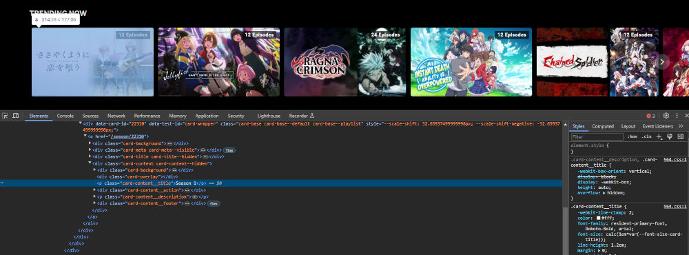
The only way you can read the title of the anime is by looking at the image, which doesn’t even have alt text. This is where it starts to affect normal users. Some of the images have very small writing that make it impossible to read. Don’t worry though, the amount of episodes is front and center. ‘Cause, you know, that’s more important than the title.
Navigating to the anime details page also reveals more div soup. No headings in sight.
Just a rant
I hope you have enjoyed my rant.
Do these things affect the common user? Nah, not really. However, the web should be accessible to all and we have semantic standards for a reason. If you are going to make a website, make it right!
<div><div>Thanks for reading!</div></div>
</post>